Bleeds - Safe Zone - Spreads - Spines
Manufacturing Tolerances
Normal manufacturing tolerances affect the guidelines for layout and the standard graphic practices for books. When working in a computer it is easy to come to believe that a line (such as the edge of a page) is perfectly straight and perfectly positioned, that the spine of a book is exact in location and width, that the two sides of a page spread exactly match. I’ve fallen into this trap myself. But with physical materials and real books, this perfection is just not the case. The reality of manufacturing tolerances must be taken into account in order for the book designer to achieve the perfect-looking, professional final result.
We use high precision equipment in printing and binding books, and our staff are committed to achieving the tightest tolerances and highest possible quality. We maintain a stable production environment to help minimize variations. But the material in use – paper – is flexible, elastic, and subject to changes in dimensions with humidity and temperature. In addition, components of the assembled book are flexible, not rigid.
The following areas are affected by considerations of physical manufacturing tolerances: Bleeds, Safe Zone, Spreads, Spine. In addition there are the normal image considerations that apply to any printing. These include color matching, control of highlight and shadow detail, minimum density of very light screens, resolution, and artifacts from compression.
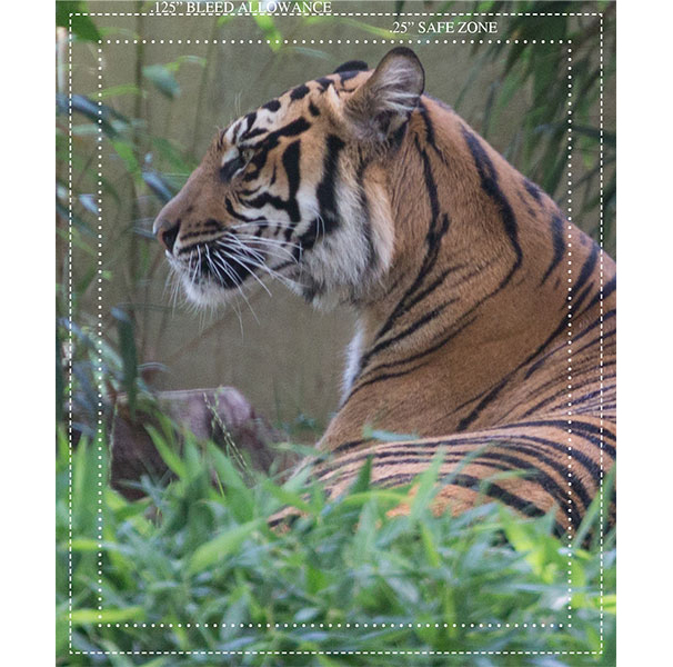
Bleeds. A page bleeds if any of the printed content runs all the way to the edge of the page. It is not possible in printing (as contrasted with web setup) to print exactly to the edge of a sheet of paper. The way a printer achieves a bleed is to print an area beyond the final page edge, and then trim the sheet back to the final edge. The extra amount printed is called the bleed allowance or bleed trim allowance. The normal requirement for bleed allowance is 1/8” = .125”, and that’s what we need. To take an example, if your final page size is 6 x 9 in portrait orientation, and you have bleeds in your book, then the file size for the page you give us should be 6.25” x 9.25”. The outer .125” of this will be trimmed off during production.
To add a little complication/flexibility, we do not need bleed allowance on the bind side of a page, because there is no trim on that edge. So as an alternative you could provide the 6” x 9” file as 6.125” x 9.25”. In this case you need to keep in mind which side of the page is the bind side: for right-hand pages, the bind side is on the left and for left-hand pages, the bind side is on the right.
In the file you provide, all pages must be the same size. If there are bleeds on one side of one page in your book, then all pages must include the bleed allowance, even if there is no image in most of those regions.

Illustrating bleed allowance
Safe Zone. Because of the manufacturing tolerances, it is not possible to position a particular point of a piece of art or type exactly at the edge of the page. We recommend that you maintain a ¼” = .25” safe zone around the inside of the final edge of all pages. Don’t put any live art (like fingers of a person or tiger ears) or type or page numbers or other critical material in that safe zone. It might get clipped during trimming, or it might just end up being positioned closer to the edge than is attractive.

Illustrating Safe Zone inside the trim box
When the text (inside pages) of a book does not bleed, then we must have an unprinting margin of at least .25" = 1/4". This is for two reasons. The first is because of safe zone considerations. The second is that the white margin area may be used on the press as a gripper area to save on the size of press sheet that's required.
Spreads. A spread is a piece of art or copy that runs from a left-hand page across the bind to a right-hand page. Spreads look great if they’re done right because they give a very wide expanse of art. Doing it right requires that we consider manufacturing tolerances again. The actual join of the left and right hand pieces is not done by printing these as a continuous wide image. Instead, the left and right pages are printed at different locations on a large sheet of paper and this sheet is folded in the bindery to make up a signature of the finished book. The folding is very good, but – again – we must consider manufacturing tolerances when working with a flexible, elastic material like paper. The two sides of the spread might not align exactly in the vertical direction. So a good design for a spread avoids placing elements across the bind which highlight any possible misalignment. No fence lines, telephone wires, eyes, etc. (to the greatest extent practical). Don’t go overboard with fear about this. Any misalignment will be very small, and it is generally not visible unless you look closely and try to find it.
That discussion deals with vertical misalignment. How about art getting lost, “ground off” at the bind. Do you need to allow for that? The first, easy answer is “no” with our smythe sewn binding, nothing is ground off at the bind. But, between signatures (not between pages) we use a thin glue line (about 1/16”) to provide mechanical strength to hold the signatures together. So you might lose visibility at the bind for art that crosses signatures. Also there is a glue line joining the first and last pages of the text to the cover (for soft cover books) or endsheets (for a hard cover book).
It's advisable that you follow the same "safe zone" practice on the binding side of your pages, in light of the fact that there are thin glue lines between signatures. It's best to avoid putting critical art in that safe zone.
Spines. Positioning of the spine area of a cover is also subject to manufacturing tolerances. We recommend that all spine copy be kept at least 1/16” away from the edge of the spine. Likewise, cover art should not be planned to hit exactly at the edge of the spine.
The thickness of the body of a perfect bound book is affected by microscopic variations in paper thickness from the paper mill (multiplied by the number of leaves). If the design of your spine is boxed in on both sides, then any variation in the thickness of the book body will make it impossible to fit the boxed-in spine exactly so the edges fall on the edges of the spine.
For hard cover books, realize that there is no sharp “edge” to the spine; instead there is a gradual curved edge. This means art should not be designed to box in the spine area. There are several ways to deal with this design issue; I’ll be happy to talk through it with you for a specific application.
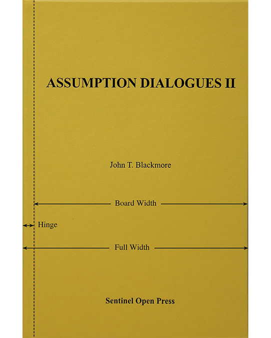
Centering on the Cover of a Hard Cover Book. The face of a hard cover book has two regions: the hard board area which takes up most of the cover, and the hinge area. Now suppose you want to put a title or piece of art on the front cover so it’s centered. Which area do you want to use as the basis for centering: the hard board area or the “full width” of the cover including the hinge area? You can think of it either way.

Center on Board Width or Full Width??
I just did a study at a local large Barnes and Noble, to see what the current practices are for centering copy on the cover. It's done both ways, centering on the board width and centering on the full width.
The loose sort of pattern is center on board width for very elaborate foil stamping which involves a border; in this case the pattern extends fairly close to the three board edges and hinge area. Where the design of the cover is less boxed in, center on the full width.
IMAGE ISSUES. For guidance on highlights, shadows, and light screens, visit here.
Printer Marks. Printer marks need to be kept out of the bleed area. As difficult as it is to believe, the default positioning of printer marks in InDesign causes them to extend into the bleed area. You'll need to set the offset to .125" (or larger) when you export to PDF.
